This page has been validated.
2. Formatting for Readability
- The reader should be able to tell at a glance what the document is, how it is organized, and where the important points are. In business and government writing, format follows function.
- The page should invite reading, not discourage it. We all sigh when we look at a document that presents immense, unbroken paragraphs with no visual guidance—no clues about what the pages contain or how to navigate them. Use lots of white space, and give the reader landmarks. Make the page reader-friendly. Break things up. Direct the eye.
- 2.1 Understand that isolation is emphasis.
- On the page, nothing is more emphatic than isolation. When you want the reader to pay particular attention to an idea, find a way to segregate it visually. Make it stand out. You might, for example, boldface the essential sentence in a memo or letter, or you might grab the reader's attention with a centered table, a heading, or an italicized phrase.
- 2.2 Don't hesitate to use headings in any document.
- Some people think it is "wrong" to use headings in letters. But in the practical world, what is "wrong" is to write a document that requires two readings to be fully grasped.
- Use headings wherever headings are helpful. In very short documents, there is probably no need for them. In longer documents, however, they are crucial clarifying devices. Rather than telling yourself, "I can't use headings because this is a letter (or memo, or email)," ask yourself, "Would headings help clarify the text?" Remember, instant clarity is what we want—because it's what the reader wants.
- 2.3 Isolate lead sentences.
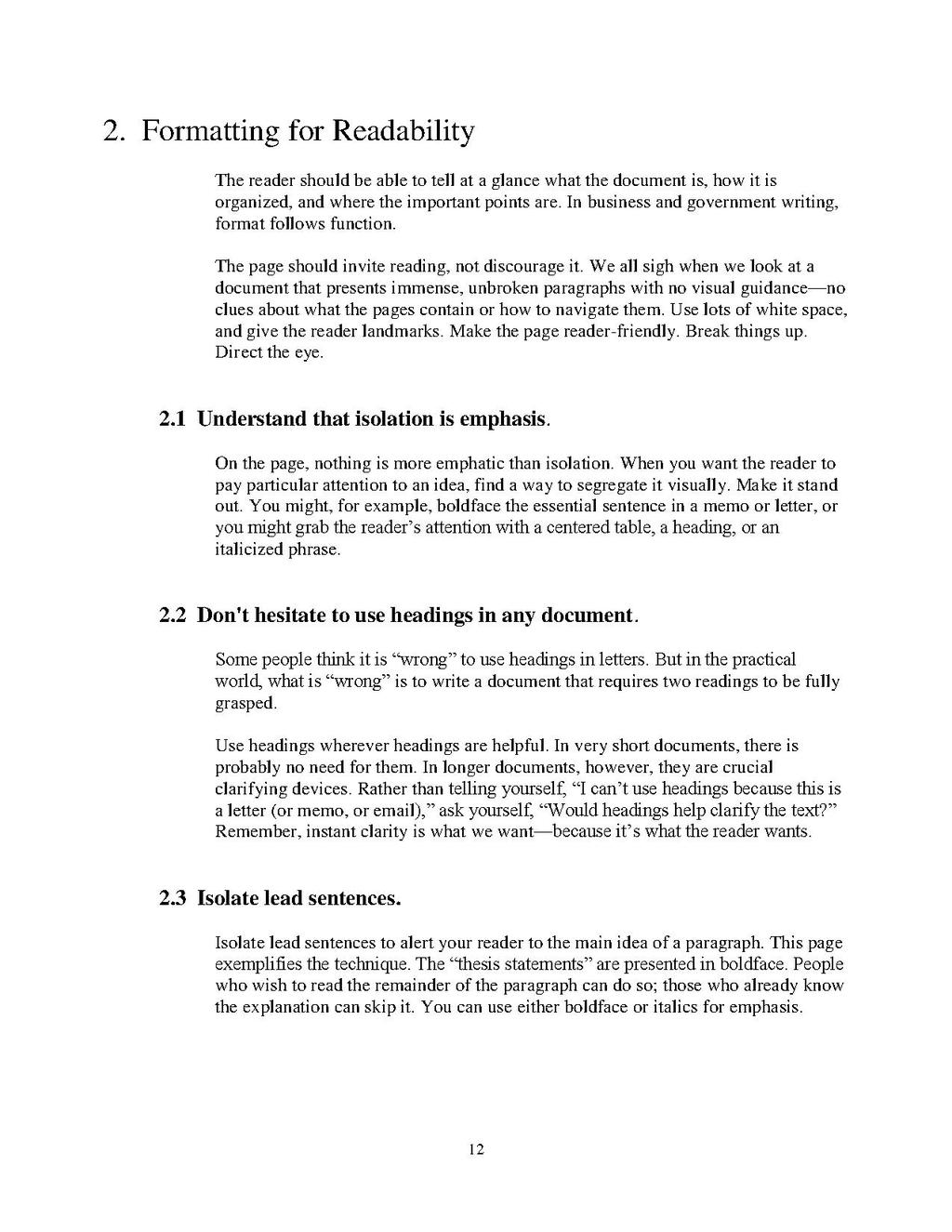
- Isolate lead sentences to alert your reader to the main idea of a paragraph. This page exemplifies the technique. The "thesis statements" are presented in boldface. People who wish to read the remainder of the paragraph can do so; those who already know the explanation can skip it. You can use either boldface or italics for emphasis.
12
