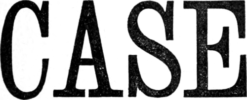
Following up the system of thickening the fine lines of the Roman characters, a letter called the Clarendon, Fig. 73, has been introduced. It is an exceedingly handsome and dignified letter, and is, as far as general proportions are concerned, similar in every respect to the Roman. It is outlined by ruling two horizontal lines at bottom and two at top, to regulate the thickness of the serifs or feet, and these may be made to project more or less, according to the space at disposal, the example presenting the maximum in this respect.
In this, as in the Roman character, the vertical are merged into the horizontal lines by curves at the angles, and the sign-painter should beware of exaggeration in this
particular. The perpendicularity of the one line, and the horizontality of the other, must not in any way be interfered with; in the sketch they should, in fact, meet and form a right angle, which should just be rounded off. Even in this particular, the work of a first-rate sign-painter is evident, for in inferior work the curve is often begun from the very beginning of the serif of the letter to hide the failure in the horizontality of the line. The painter may in this, as in other departments of work, be assured that it is in the refinement of points such as these where the skilled artisan, possibly only another name for the artist, is distinguished from the common handicraftsman.
Fig. 74 is another specimen of Clarendon in a condensed form, and narrower than this, the letter should never be

