Help:Preparing for export
 | This page in a nutshell: Avoid certain formatting (e.g. fixed-width sections), ensure all sections and content are included, and test the exported file if possible. Then, add category Ready for export. Always consider what happens on a very wide and very narrow screen. You cannot control or make assumptions about the size of the screen or font sizes: the physical screen size/DPI and/or user's layout preferences will always win. |
Why should works be prepared for export?
[edit]- It means people can read our works on their mobile devices like e-readers, as well as print our works effectively
- It means the works are more likely to be accessible to users using screenreaders
- Adding them to Category:Ready for export makes them available via the OPDS catalog for providing lists of Wikisource works to e-readers
- If works export well, they also probably are improved in other areas, such as good markup and presentation on the mobile and desktop website.
Preparing works for export
[edit]Certain things must be checked before marking a work as "ready for export".
- The work must be complete and fully proofread
- The work must be a self-contained unit (i.e. not a single chapter of a larger work).
- Consider what content is exported and in what order.
- Check the formatting is suitable for exported formats.
- Add Category:Ready for export when, and only when, the work is ready.
- Use {{Export formatting needed}} to mark a page as needing work for making it ready for export (adds to Category:Works needing export formatting).
- Use {{Export to check}} to mark a page that you think is ready but would like to be checked (adds to Category:Works needing export check).
Checklist
[edit]You can use this list as a quick checklist. The items on it are explained in more detail below.
- ☐ Do ensure no content that you want to export is in a header only - this will not export
- ☐ Specifically, do ensure section/chapter headings are in the page body (they can be in the header too)
- ☐ Do make sure that either:
- ☐ Every page you want in the export is linked from the root page, or
- ☐ Every page you want in the export is linked from a page that is linked from the root page and is inside a container with the class
ws-summary(see {{AuxTOC}} or {{export TOC}})
- ☐ Do add page breaks between content that should start on a new page. Normally sections of front/back matter and chapters (chapters on their own sub-pages will automatically get page breaks)
- ☐ Do set a cover image in the header of the top-level page if there's a useful one
- ☐ Don't use px units for any containers that contain text - use em units or don't set any width
- ☐ Don't use percentage (%) widths under about 80%: on small screens, these make the text content excessively narrow. Set an em-based max-width if needed, or use a template like {{quote}}
- ☐ Don't use any formatting that will not work if the page is narrower than 360px (images will scale automatically, you can use images larger than this)
- ☐ Don't use
::::or {{gap}} to simulate centering or right alignment - ☐ Do use {{block center}} for narrow content like poems
- ☐ Don't apply global CSS such as containers that set a width to prose
- ☐ Don't use constructions that do not export well unless absolutely required:
- ☐ {{outside L}}, {{outside R}}, {{outside LR}}
- ☐ Fixed columns: {{multicol}}, the use of tables for columns in general. {{div col}} will export (correctly) as a single column (width should be set to a suitable size if the default—12em—is not appropriate).
- ☐ {{tooltip}}, {{SIC}} will not be usable (or visible) on many devices. Do not use it for important content.
- ☐ {{overfloat image}}
- ☐ Some TOC template do not export well: for example {{TOCstyle}} and {{Dtpl}}. {{TOC begin}} and plain wikicode tables both work.
Headers are not exported
[edit]The {{header}} template is not exported[1]. This includes the notes field. There should be no content in that field that is necessary for the navigation of the e-book. For example, do not put a Table of Contents in that field if there is no TOC also in the main text body.
Also, do not rely on a single "next" link to provide navigation to begin the book. Use a TOC on the front page of the work.
Headers fields set ebook metadata
[edit]Although the template itself is not exported, some fields of the header template construct microformat data in the page that's used to set the metadata of the exported book. Thus, you should take care that fields such as the title and author in the template is how you wish to see it in the final exported version.
In particular, note that the page title on Wikisource does not affect the e-book title.
Covers
[edit]Set the cover image (which is what e-readers will use for the book in thumbnails) using the cover field of {{header}}. Do not include "File:".
- For a simple image, just use the filename:
My book cover.jpg - For a page of a multi-page document:
My book.djvu/7
If there is no suitable cover, or the cover is a blank binding, you do not need to set a cover.
Section titles in the text body
[edit]As headers are not exported, if there is no section title in the text body, there will be no section title in the exported work. Each sub page will start on a new page, but there will be no title. The titles in the original work should always be included, even if the title is also in the header:
{{header
 ...
 | title   = Paul Clifford
 | section = Chapter 1
}}

<!-- the title below is mandatory -->
{{center|{{larger|Chapter 1}}

It was a dark and stormy night
Listing pages for export
[edit]The export tool looks for links to subpages on the top level page and uses them in the order that they appear. Usually, this works well, as most works are either on a single page, or have a Table of Contents (TOC) on the top page that lists all subpages in order.
The subpages can also have their own TOCs, which will generate a hierarchical export TOC. In this case, the subpage TOCs must be inside a container marked with the class ws-summary[2]. {{AuxTOC}} and {{TOC begin}} apply this class automatically. If you need to manually mark a subpage TOC, {{export TOC}} is for you, and if you want the TOC to be invisible but still read by the exporter, {{hidden export TOC}} (this is pretty rare and kind of a last ditch). Avoid adding the class directly to elements, and prefer the use of a standard template where possible (for tracking and maintenance purposes).
If a work does not have such a top-level TOC (e.g. it only has multiple TOCs on subpages, which can happen for multi-volume works), you must add a TOC that WS-Export can read using one of the above methods.
If you use any template that applies ws-summary (e.g. {{AuxTOC}}), then only links in that container will be used by default. If you have other links to include (e.g. in a TOC that's part of the original work), you can wrap that TOC in {{export TOC}} to add the ws-summary class to it.[3]
You can use the template {{hidden export TOC}} to add an invisible list links, so the export tool can use them, but they do not appear to readers. This is a last resort, because the invisible list of subpages can easily become stale without being noticed (due to being invisible to editors).
Formatting for export
[edit]Some formatting that works well on a device with a large screen and feature-rich browser, like a computer, does not work so well on less-capable devices like e-readers. There are some things you can do to make the EPUB and MOBI exports look and function better on e-readers. There are some main things you should consider when formatting a work with a view toward exports:
- E-reader devices generally have much smaller screens
- E-reader devices, apps or the ebook export tools may not support all formatting features that work in browsers
- Some content visible on Wikisource is excluded from the exported formats
Formatting for small screens
[edit]Smartphones often have an effective pixel width[4] of around 350px. For a "normal" font size, this is about 23em. Because e-readers can adjust the font size, you should be cautious when making assumptions about screen width in relative terms such as "em". If the user has set a large font (perhaps due to their vision), they may have a page only 10em wide.
Avoid fixed-width formatting
[edit]
Any formatting that uses a "fixed width" is at risk of not fitting on a mobile device screen, especially if the width end up over about 350px.
In the following examples, the red box is a simulation of a small screen, and any content that spill out is either not visible at all, or must be scrolled to be seen. Green boxes are an indication of correct formatting.
Here, we have a fixed-width block that is wider than the screen. Everything outside the red box will spill off the screen on an e-reader of that size:
<div style="border:1px solid red; margin:auto; width: 25em">
<div style="width:40em;>
{{lorem ipsum}}
</div>
</div>
Lorem ipsum dolor sit amet, consectetur adipisicing elit, sed do eiusmod tempor incididunt ut labore et dolore magna aliqua. Ut enim ad minim veniam, quis nostrud exercitation ullamco laboris nisi ut aliquip ex ea commodo consequat. Duis aute irure dolor in reprehenderit in voluptate velit esse cillum dolore eu fugiat nulla pariatur. Excepteur sint occaecat cupidatat non proident, sunt in culpa qui officia deserunt mollit anim id est laborum.
Many templates have built-in defences against this: {{block center}}, for example, applies a default max-width of 100%, which prevents it growing larger than the container:
<div style="border:1px solid green; margin:auto; width: 25em">
{{block center|width=40em|{{lorem ipsum}}}}
</div>
Lorem ipsum dolor sit amet, consectetur adipisicing elit, sed do eiusmod tempor incididunt ut labore et dolore magna aliqua. Ut enim ad minim veniam, quis nostrud exercitation ullamco laboris nisi ut aliquip ex ea commodo consequat. Duis aute irure dolor in reprehenderit in voluptate velit esse cillum dolore eu fugiat nulla pariatur. Excepteur sint occaecat cupidatat non proident, sunt in culpa qui officia deserunt mollit anim id est laborum.
Avoid specifying widths in pixels
[edit]Historically, it has been common on the web to specify sizes in pixels, or "px", rather than sizes relative to the font size. This can lead to issues on modern high-DPI devices, because while a normal browser defaults to a fixed px-to-em ratio of about 1em = 16px, e-readers have no such fixed relationship: it depends on the font size the user has customised[5].
Therefore, when specifying widths of things that will contain text, you should always use units relative to the text size, e.g. "em". Generally, converting px to em by dividing by 16 will produce the same result in a default browser, but will also work correctly in e-readers and browesers with changed font sizes.
Below is an example of a {{block center}} template using "px" and "em" units on an e-reader screen roughly 1000px across (but with a large font size of about 1em = 40px):
.png)
420px (in browser) the text wraps where expected.

420px (on 1000px-wide e-reader): less than half the width is used and the text is wrapped much more tightly that on a browser.

30em (on e-reader): the container is proportionally wider to account for the larger font-to-pixel ratio
Images are still specified in "px", as that is how the MediaWiki software prepares them. This may result in images being smaller than you expect on a high-DPI device.
Avoid specifying widths in percent
[edit]Because export devices (and mobile devices, and desktop windows in general) cannot be assumed to have any particular size, it's also bad practise to use percentages (% units) for constraining widths.
On a small screen (or a narrow container like Layout 2), a TOC that specifies a width of 75% is probably going to wrap too much and waste space on the sides:
.png)
Bad: 75% (on 500px-wide e-reader): 25% of the horizontal width is wasted, when, on this device, it's useful screen area
_2.png)
Bad: 75% (on a wide desktop): 75% is still too wide if the user sets a wide layout (e.g. Layout 1) in a wide window. Thus, the original readability goal of preventing the table becoming too wide has not been achieved
_2.png)
Good: 30em (on e-reader): the container uses all the space when the screen is smaller than 30em
_2.png)
Good: 30em (on desktop): the container is limited to 30em when the screen is wider than that, which achieves the original readability goal of preventing the table becoming too wide on a wide screen
You can sometimes set a width in percent over about 80%, but even then, it's probably more likely that a left/right padding of an em or two is actually more correct formatting, since it will not depend on the exact screen size.
Avoid wide fixed-width images
[edit]Images are also often elements that spill off pages, as they are specified in pixels and are frequently wider than 350px:
[[File:Frontispiece, What Katy Did at School, 1876.png|500px]]

Note that the Dynamic Layouts "Layout 2" has a central text column width of 36em. At "normal" font sizes, this is 576px, so any image large than this will likely not render correctly in Layout 2 on the main website.
Many ebook readers (and the mobile Wikisource site) provide extra logic to ensure images fit the screen, so you may find this is not an issue. The EPUB and PDF export tools apply this logic too. However, it is possible apply your own CSS that nullifies this protection, so beware when setting image sizes.
An alternative is a template like {{img float}} or {{FI}} that provides CSS that prevents the image being larger than its container, but still allows the image to expand up to the given pixel size, if there is space to do so:
{{FI
 | file = Frontispiece, What Katy Did at School, 1876.png
 | width = 500px
}}
On a 350px screen, the image will not spill out:
On a 600px screen, the image goes up to the specified 500px:
Avoid fixed indenting
[edit]Indenting by a large amount with the following construction (sometimes used to simulate right alignment) can spill off the page:
:::::::::::::::Indented content
- Indented content
Depending on what you are trying to achieve, one of the following might be more suitable:
{{right|Right aligned}}
{{right|offset=2em|Right aligned with offset}}
{{center|Centered}}
Right aligned
Right aligned with offset
Centered text
The same goes for using large values with {{gap}}. In the below images, a green box shows the gap elements:
.png)
In the browser, the gap pushes the text to the right
.png)
In an e-reader, the large gap causes the text to wrap and end up on the left.
The correct solution to this problem is to right-align "Goethe" using {{right}}, rather than indenting it:
<poem>
...
Auf den dunkeln Erde.
{{right|Goethe}}
</poem>
Auf den dunkeln Erde.
GOETHE
Avoid fixed columns
[edit]Most e-reader rendering engines do not support reflowable multiple columns, because it is technically hard to layout the text in columns in a paginated environment. {{div col}} degrades gracefully to a single column in this case.
Fixed column layout look fine on a computer, but they can become very squeezed on small screens (in this case, 350px is used as an example):
{{div col|3|width=1em}} <!-- default is 12em -->
{{lorem ipsum}}
{{div col end}}
Lorem ipsum dolor sit amet, consectetur adipisicing elit, sed do eiusmod tempor incididunt ut labore et dolore magna aliqua. Ut enim ad minim veniam, quis nostrud exercitation ullamco laboris nisi ut aliquip ex ea commodo consequat. Duis aute irure dolor in reprehenderit in voluptate velit esse cillum dolore eu fugiat nulla pariatur. Excepteur sint occaecat cupidatat non proident, sunt in culpa qui officia deserunt mollit anim id est laborum.
You should specify the minimum width of the columns using the width parameter, so that the number of columns reduces in narrow screens. The correct minimum width may well depend on the content, but generally, around 12em is a good lower bound, below which columns tend to start looking very squeezed.
{{div col|3|width=12em}}
{{lorem ipsum}}
{{div col end}}
Lorem ipsum dolor sit amet, consectetur adipisicing elit, sed do eiusmod tempor incididunt ut labore et dolore magna aliqua. Ut enim ad minim veniam, quis nostrud exercitation ullamco laboris nisi ut aliquip ex ea commodo consequat. Duis aute irure dolor in reprehenderit in voluptate velit esse cillum dolore eu fugiat nulla pariatur. Excepteur sint occaecat cupidatat non proident, sunt in culpa qui officia deserunt mollit anim id est laborum.
Table-based columns templates like {{multicol}} cannot do this, and these are very likely to produce ebook content that is difficult to read due to extremely narrow columns, especially if there are more than 2 columns.
Sometimes, for things like side-by-side translations (as is common in bi-lingual treaties, for example), there might be not much you can do about this.
Block-center narrow content
[edit]There are no dynamic layouts in exported formats, so narrow text (e.g. plays and poems) will be left aligned on the screen unless something like {{block center}} is used. The following is a screenshot from a real e-reader device:
-
 Without block center
 -
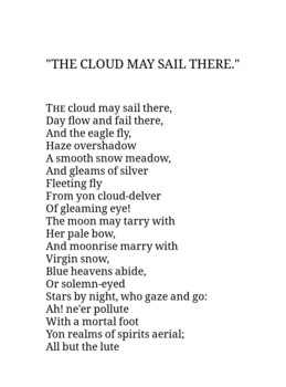 With block center


However, prose should not be placed in a block center, as this affects the layout on the main website. Use dynamic layouts for on-wiki presentation and allow e-readers to display the prose normally.
Be aware of export limitations
[edit]Some export formats have limited scope for styling (especially plain text) and you should take care to use constructs that degrade gracefully in these situations.
Some templates, like size and alignment templates, have no effect in these exports. Other templates are specifically designed to work as correctly as possible without styling:
Capitalisation and {{small caps}}
[edit]It is a common construct to use {{small caps|lowercase}} to simulate a word in small caps, rather than {{sm|smaller uppercase}}, eg. SMALL CAPS. However, this is incorrect if the word should be capitalised, for example: "London" or "LONDON" (on a title page). E-readers, exports (such as plain text) that do not support small caps and screenreaders would present "london" to the reader.
In this case, you should use {{all small caps}}:
| Markup | Produces | Copy-pastes/exports as |
|---|---|---|
| {{sc|London}} | London | London |
| {{sc|london}} | london | london |
| {{asc|London}} | London | London |
| {{asc|LONDON}} | LONDON | LONDON |
| {{sm|LONDON}} | LONDON | LONDON |
Complex or Wikitext-only markup
[edit]Obsolete tags
[edit]Obsolete HTML tags like <center>...</center> are not understood by some ebook formatters. Do not use them, and prefer templates like {{center}} instead. Such tags are also often lint errors too, so they should be removed anyway.[6]
Dot leaders
[edit]Table dot-leaders generally do not export well, as they are generated by a complex "hack" that some ebook readers do not understand[7]. Most dot-leader templates exclude the dots from the export for this reason.
Other considerations
[edit]Page breaks
[edit]The {{page break}} template should be used to force page breaks in ebooks. It contains special CSS that ebook readers can use to paginate content. This is often useful in the front matter of books where the content should not flow together:
Example
{{center|Page 1}}
{{padded page break}}
{{center|Page 2 - this will be a new page in an e-reader}}
Page 1
Page 2 - this will be a new page in an e-reader
You can use {{invisible page break}} for a page break that allows proper pagination on e-readers, but is invisible here on Wikisource. This can be useful for things like lists of verses or sections that start on a new page in print, but are transcluded together at Wikisource.
Example
{{center|Page 1}}
{{invisible page break}}
{{center|Page 2 - this will be a new page in an e-reader}}
Page 1
Page 2 - this will be a new page in an e-reader
Testing
[edit]You can test e-book formatting in 2 ways:
- Viewing the online page in a browser's "mobile view".
- Downloading an EPUB or MOBI format and viewing on an e-reader or e-reader app. Only this method allows to you to check for issues like missed sections.
You can also use the W3C EPUB validator tools to check technical correctness of EPUB files.
Online viewing
[edit]You can use the "Mobile view" gadget under "Development" in your gadgets preferences, which shows the page in both the desktop and mobile mode, as well as simulating a narrow screen.
You can also test how a page looks in a mobile browser (which is generally broadly similar to most e-reader devices) by using the "Responsive Mode" in your browser. In Firefox, this is Ctrl-Shift-M and in Chrome it is also Ctrl-Shift-M, but the developer tools have to be opened first.
As a rule of thumb, if the work looks OK in both Layout 1 (full-screen width) and Layout 2 (constrained central column), it will generally be OK on mobile. However, Layout 2 is still about 50% wider than a phone screen, so you could miss some issues if that's your only method.
Using an e-reader or e-reader program
[edit]You can test e-reader compatibility by downloading the EPUB or MOBI file as normal and opening it on an e-reader device or with an e-reader program or simulator.
Native desktop programs that aren't dedicated simulators generally use fully-capable HTML renderers (like browsers do) so they may do better than real devices at rendering content.
Examples of e-reader programs
- Most PDF viewers on Linux
- Calibre eBook Reader
- Firefox e-reader Extension: https://addons.mozilla.org/en-US/firefox/addon/epubreader/
- Koreader: (runs on Android and many e-readers, has a desktop "emulator") https://github.com/koreader/koreader
Examples of simulators that attempt to render an ebook as on a device:
- Kindle Previewer (Windows only): https://www.amazon.com/gp/feature.html?ie=UTF8&docId=1000765261
- Adobe Digital Editions: https://www.adobe.com/solutions/ebook/digital-editions/download.html
Issues to address
[edit]Wikisource issues
[edit]There are some site-wide issues that lead to issues in ebooks. Not all of these may be tractable to fix.
- Dot-leader tables: as mentioned, these do not look good due to the hacks used to format them. There is probably not a lot that can be done about this, other than simply not using them. For now, most dot leader template use
ws-noexportto suppress the dots on export and degrade to a simple table. This only works for templates like {{TOC row 1-dot-1}}. Templates like {{Dtpl}} and {{TOCstyle}} use very complex formatting that usually doesn't render properly on e-readers and are still broken. - {{TOCstyle}} in general doesn't work well, as it embeds a whole table in each
<li>element. Generally for 2-cell rows it works, for 3-or-more-cell, it's patchy. - Sidenotes rarely work in ebooks. Generally they are simply inlined with the surrounding text usually with a fairly acceptable result.
- {{outside L}}/{{outside R}} in conjuction with a forced margin produces very narrow main body text: phab:F34488480.
- {{sfrac}} does not work well - the line ends up spanning the whole page. Some usages can be changed for Unicode fractions, but not all. See phab:T256981. Works in some readers.
- {{overfloat image}} is hardcoded to use pixels for sizes. This is pretty much guaranteed to break if the image is rescaled (e.g. on mobile)
- Web fonts (like {{blackletter}}) do not include the font in the exported file. See phab:T270743.
- URLs in CSS (occasionally used for graphic borders) for are not exported: phab:T256780
- {{TOC link}} causes multiple entries in the TOC: phab:F34643733
E-reader issues
[edit]These might indicate issues in Wikisource HTML output (in which case they belong above), ebook conversion (open a WS-export bug) or the apps/devices themselves (open issue on those projects).
Generally issues relate to the underlying engine used to render ebooks, rather than the reader software itself.
- Moon+Reader:
- "Ebook mode": unknown
- "Browser mode": Some kind of Chrome-based engine
- Koreader:
- Epubs: Forked CREngine
- PDFs: muPDF
- Calibre viewer: Chrome engine
- Nickel (Kobo stock reader):
- EPUB: RMSDK
- kEPUB: NetFront ACCESS
- FBReader: Unknown
- Kindle: Own renderer (?)
| Moon+Reader (Normal mode) |
Koreader | Calibre viewer | Nickel (Kobo stock) |
Kindle | FBreader | eBoox | |
|---|---|---|---|---|---|---|---|
| {{block center}} | No | Yes | Yes | No (duplicates things) | ? | No | ? |
| {{small caps}} | No | Yes | Yes | Yes | ? | No | ? |
| {{ditto}} | No | No | Yes | Yes | ? | No | ? |
| {{bar}} | Yes[8] | Yes[8] | Yes | Yes | ? | Yes[8] | ? |
CSS max-width |
No | No | Yes | Yes | ? | No | ? |
CSS width |
No | Yes | Yes | ? | ? | No | ? |
Table with CSS margin:auto |
N/A (table not shown as table) | Yes | Yes | No | ? | No (no table shown) | ? |
<math>[9] |
No | No | Yes | Yes | ? | No | ? |
| {{***}} inside {{block center}} | Yes (but no gaps) | Yes | Yes | No | ? | OK | ? |
| {{flatlist}}[10] | No (no effect) | No (shows ·) |
Yes | Partially (no dots or brackets) | ? | No (no effect) | ? |
| {{plainlist}} | No (no effect) | Yes | Yes | Yes | ? | No (no effect) | ? |
| {{sfrac}} | No | Yes | Yes | Yes (but valign wrong) | ? | No | ? |
| {{fqm}} | ? | No | Yes | ? | ? | ? | ? |
| {{redact}} | ? | No | Yes | ? | ? | ? | ? |
| {{redact2}} | ? | Yes | Yes | ? | ? | ? | ? |
| {{div col}}[11] | ? | Single col | Single col | ? | ? | ? | ? |
| {{tooltip}}[12] | ? | No | Yes (length limit) | No | ? | ? | ? |
| {{dotted TOC page listing}} | No | No | Yes | No | ? | Almost | No |
You can use User:Inductiveload/Export test to check what constructs work on platforms you have access to.
- ↑ Because it sets has CSS
class="ws-noexport". - ↑ See phab:T253282.
- ↑ For example, Erotica does this.
- ↑ Modern devices often have HD displays of over 1000 pixels' width, but a scaling factor is applied to make the text readable. Usually this factor is between 2 and 4, depending on the device's physical size and resolution.
- ↑ Visually-impaired browser users my also set a larger system font, so this is a general accessibility issue, not an export-only issue.
- ↑ The WS-export tool auto-converts some of these constructs (the code is around here), but they should still not be added to new works.
- ↑ True CSS dot-leader support has been suggested, but it has been stagnant for over a decade: https://www.w3.org/TR/css-gcpm-3/#leaders
- ↑ 8.0 8.1 8.2 Em-dashes shown, line hidden, with workaround in MediaWiki:Epub.css
- ↑ Formula export uses some standard-compliant but fairly "esoteric" SVG that is not well supported: phab:T270589
- ↑ Wikisource bug: phab:T271390
- ↑ For a paginated display, degrading to a single column is better than chopping multiple columns horizontally. For example, if the list "Alpha, Bravo, Charlie, Delta" is split across two pages, you do not want to see:
Alpha      Charlie
-------------------
Bravo      Delta
- ↑ Generally speaking, tooltips are a UX problem on touch-screen devices since there is no "hover" concept.